Building a design system, brick by brick
OVERVIEW
When I joined Teya, it had a number of products, each within its own design system. This was tricky to maintain and more importantly, contributed to an inconsistent and confusing user experience. Rallying a team of designers, I built a new design system from the ground up to improve the efficiency of the design team and the experience for the end user.
In this case study, I will go through the process of designing this design system from scratch.
SETTING THE SCENE
To illustrate the wildly different design systems that existed in one company, here’s a snapshot into the look and feel of Teya’s products:
Selected screens from the Upswells App
The CHALLENGE
The lack of a shared design system was resulting in a subpar user experience and operational inefficiencies
Subpar user experience: The lack of cohesion across our products resulted in a disjointed and confusing experience for merchants using multiple products.
Operational inefficiencies: The lack of a single source of truth for designers as well as developers was resulting in confusion and duplicated efforts. In addition, anticipating changes in our brand's identity (which indeed happened a few months later), we recognized the need for a design system that could help us update the visual identity of the products.
We built each component from scratch, building a modular and intuitive design system
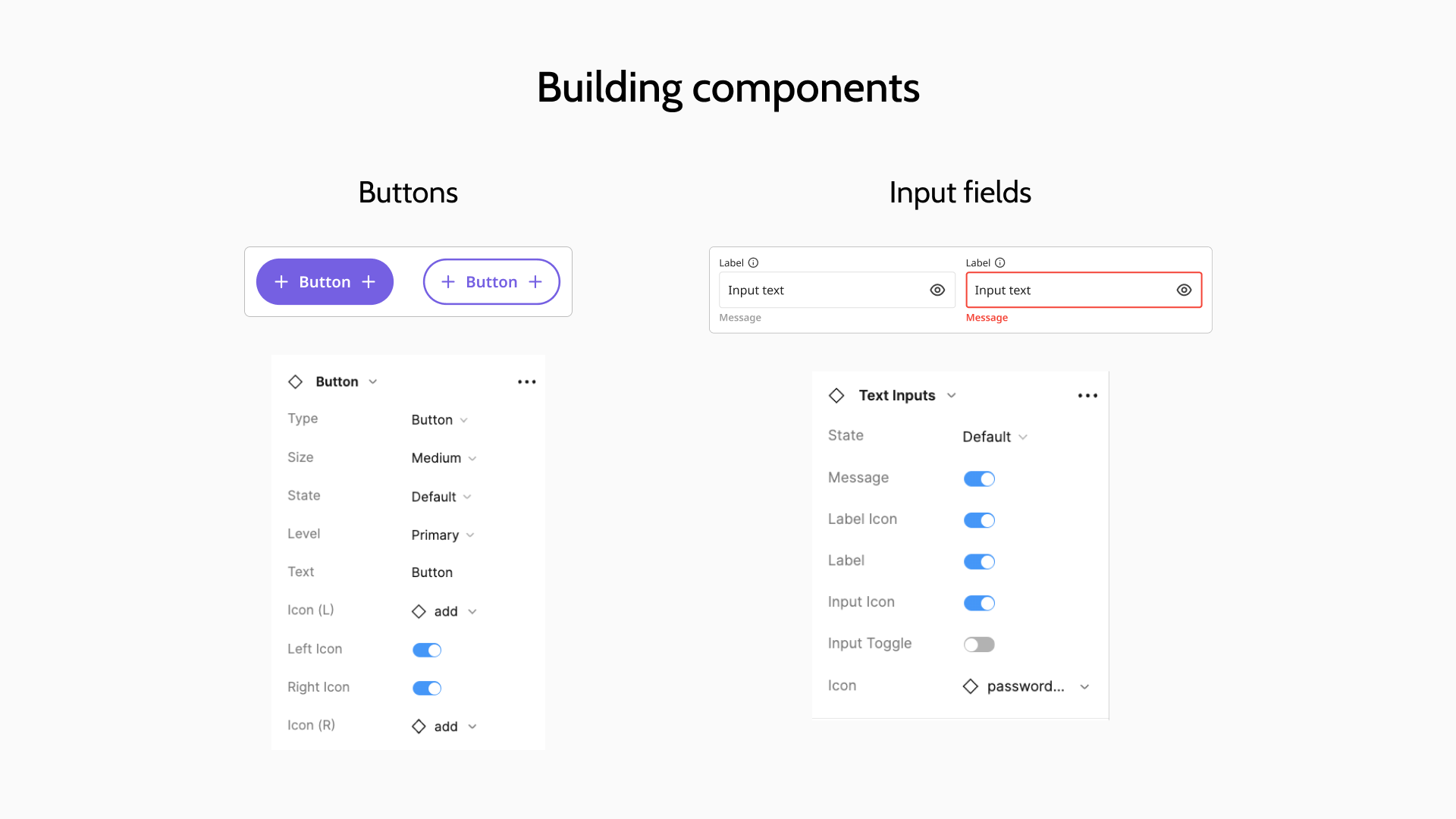
We first did an audit of all the components we were using across products and made a list of the essential common denominators. Inspired by the atomic design system, we set the foundations like typography, colours and spacing. We then started building smaller components, gradually scaling up to more intricate ones. This strategy ensured a cohesive and manageable system.
We leveraged Figma’s latest features on components to make them easy to use and modify with the flip of a toggle. I built 50% of the total components myself - from the buttons to the text inputs.
We then added extensive guidelines to make sure that any designer or developer who accessed the design system could use it effectively.
I made sure the design system was 100% accessible.
After we had designed the components, I tested every single one using a contrast checker to ensure that it met the AA guidelines. I had to make quite a few tweaks to the colours to ensure that they were accessible.
We finished creating the design system right on time for a rebrand
We created the design system and then overnight, we got a new brand. We were all relieved that we had a design system in place to make the rebrand operationally much easier than it would have been if we had to change every single design manually.
At the end of this process, we achieved consistency among all the products from the company.
Not only was this a significantly better experience for the end user, it also made our design team more efficient and effective.
PERSONAL TAKEAWAYS
A design system is a great operational tool and can help save time and effort
Maintaining and improving the design system is a team effort, and changes to a component might have different knock on effects across products
Accessibility is important and should not be overlooked


