How can increase engagement on a savings app?
Overview
Client: Mily* (Fintech)
Role: Product Designer
Key Responsibilities: Brainstorming and research, wireframing & prototyping, extending the visual language in high fidelity designs, UX writing
Team: Design Lead (Aakash Rodrigues), Client Team
Timeline: October - December 2021
*name changed for client confidentiality
Selected screens from the Mily App
Background
Mily is a mobile app that helps people to save up for their next purchase and gives them rewards for doing so.
Mily enables users to save up for a range of products - from mobile phones to laptops. Upon starting a goal, users set their goal amount and goal duration, and then make deposits every month to achieve the goal. Users are rewarded each time they made a deposit with scratch cards that unlock rewards - these rewards can be used towards making the final purchase that they were saving up for.
Note: while it was an entire app redesign, I am going to focus on tackling improving engagement on the app.
The problem
Engagement on the current version of the app was predicted to be too low
Assuming that people would make deposits only every month or every couple of months, the client was worried that the engagement rates of the app would be too low, since users would have no reason to check in to the app otherwise. Further, the client wanted to remove the time constraint on the goal settings to give users more flexibility - so we needed to find a different way to add urgency for users to make deposits.
Here are some of the issues we found with the original Active Goal screen (what users saw once they had started a goal)
Original Active Goal screen
DESIGN EXPLORATIONS
We explored a number of options to visualise progress
We did a competitor analysis and drew inspiration from various apps - from GooglePay to Mint.
Select screens from competitive research
Explorations for visualising progress
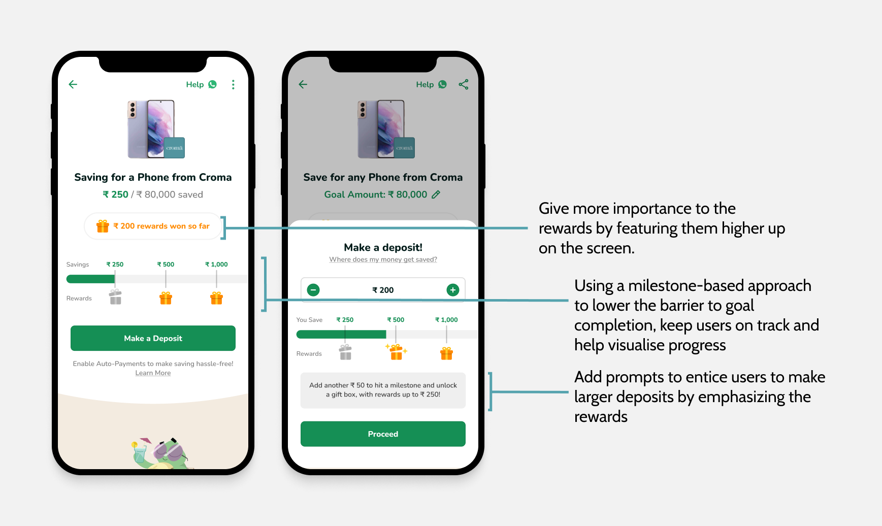
We used a milestone-based approach to make the goal more manageable and rewarding
Upon evaluating options, we decided a milestone-based approach (option 2) would be the best suited to the goal of improving engagement. By breaking the large goal into more manageable chunks, this would make the goal feel more within reach - lowering the barrier to goal completion. Further, by encouraging users to save smaller amounts every so often, we hoped this would help build a savings habit.
We decided to run with a variation of option 2. We hypothesised that tying rewards to the milestones, so that every time a user hits a milestone they unlock a reward, would increase in-app engagement.
We added multiple reward cards to entice users and improve daily engagement
Assuming that people would be making deposits infrequently and so they wouldn’t have reason to open the app too often, we decided that instead of providing one reward card per milestone, we would provide a “gift box” instead. This gift box would contain multiple reward cards, each being unlocked every subsequent day. This would increase engagement by enticing users to come back to the app in the following days to claim rewards - providing both immediate and delayed gratification. Also, with each reward being variable, we hypothesised it would keep the user motivated to reach the end.
We added microanimations to bring the entire flow to life. Check out a sneak peak of the deposit flow:
Final prototype
Outcome
We had limited access to metrics since this version of the app did not launch, but in order to measure success I would look at these KPIs:
Daily Active Users (to indicate whether in-app engagement increased)
Frequency of deposits made (to indicate whether achieving milestones and unlocking rewards motivated people to deposit more often)
Additional learning:
Microanimations help bring your design to life and even small changes make a big difference
Rewards can be a powerful motivator
Microcopy can be used to give an app personality, provide guidance, and make the experience more delightful


